88 ways to ask for help, and no way to find the right one
Context
A major Italian energy utility had an internal ICT support portal used by nearly 4,000 employees. Over the years, every team had added its own services, named the way that team understood them internally. By the time I joined, the directory had grown to 88 entries with no shared logic behind them, just years of departments solving their own problems in isolation.
Why this mattered
This wasn't a cosmetic problem. People couldn't find the right service, so they raised the wrong ticket, or gave up and called someone directly. And the friction didn't stop once a ticket was open. Status and next steps were often unclear, leaving people unsure whether something was waiting on them or simply in progress. On a system used by thousands of employees every day, that adds up to a real operational cost, not just a frustrating interface.
Constraints
Card sorting was run with real users of the portal, but not as a fully blind study. Some participants had been involved in the project from earlier phases and had already seen the results of the heuristic evaluation. Their input may have been shaped by that prior exposure rather than a fresh, independent read of the terminology. Alongside that, my team went through roughly 90 pages of real support requests, reading how people described their own problems in their own words, to widen the picture beyond that sample.
What I discovered
A heuristic evaluation against Nielsen's ten principles surfaced dozens of specific issues. Underneath them, four patterns kept repeating across the whole portal: inconsistent components and interactions, weak feedback on system state, terminology built around internal IT structure instead of user mental models, and critical moments left unprotected where a mistake was costliest.
The weak feedback pattern showed up most clearly after a ticket was opened. Status changes and next actions weren't communicated in a way that told people whether the ball was in their court or someone else's, so they'd default to calling to find out. The terminology pattern showed up earlier in the journey: menu labels routinely pointed to destinations that didn't match what they promised, evidence that the whole portal had been built from the inside out, department logic first, user logic never.
The whole portal had been built from the inside out. Department logic first, user logic never.
Two of these patterns pointed at the same root cause. People weren't just struggling with individual screens, they were navigating a system organised around IT's internal logic instead of their own. That's what turned this from an interface fix into a structural one. Relabelling a few menus wouldn't help if the underlying organisation of services still didn't match how people actually thought about their problems.
Key decisions
The clearest decision was shifting from supply-side logic to demand-side logic, naming things the way people ask for them rather than the way IT organises them internally. Getting there took testing three ways to group the directory: by object, by action, and by service type. None of them held up alone, because different users think about the same problem differently. An engineer searching for a broken tool types the name of the software. An intern with the same problem types "malfunction." Neither is wrong, and a single taxonomy would have made one of them invisible to the system.
So instead of forcing one logic, we merged them. Each entry under the five macro-categories carries object, action, and type together, so it's findable however someone happens to be thinking about it that day. The multi-tagging also strengthened the search layer, allowing AI-assisted retrieval to match the same service from different types of queries.
Trade-offs
The card sorting gave us genuine input from real users, which mattered. But some participants had prior exposure to the project and its findings, so the results likely carry some bias toward what they already expected to see rather than a fully independent read. It's a limitation I'd flag rather than hide. The sample was real, but not clean.
Solution
We kept one thing deliberately unchanged. Some users, mostly managers approving routine requests or people opening the same kind of ticket daily, already had a flow memorised and didn't want or need the new guided experience. For them, the ticket flow preserves something close to the old, direct path, so the redesign didn't slow down the people who were already fast. Alongside that, we added the ability to save not just drafts but full templates, plus favourites, for anyone who opens the same type of request repeatedly. It meant building two experiences that felt like one system, not compromising the new structure to protect the old habits, and not forcing habitual users through a guided flow they didn't need.
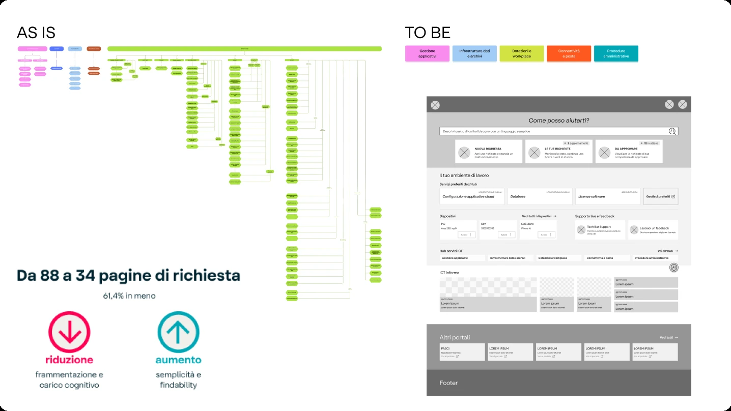
The rebuilt directory went from 88 entries to 34, organised around five user-centred categories with the merged tagging system underneath. Full-application wireframes covered every flow, from the homepage and directory to request forms, appointment booking, and the manager approval queue, treated as one connected system rather than isolated screens. This became an interactive prototype across desktop and mobile, tested with stakeholders before development.
The design system resolved the inconsistency the evaluation had flagged: one loading pattern instead of three, two clearly distinct chip types instead of one ambiguous one, standardised modals, tooltip rules tied to actual information value. Every decision was documented in Zeroheight with the reasoning behind it, not just the specification.
The last piece was a governance framework, a scoring model across five dimensions that decides whether a new service belongs fully in the directory, links externally, or stays separate. It was tested against real past cases before release, and it gave the right answer on both, with a clear reason attached. That was the part meant to outlast the project. Without it, the directory would start accumulating the same way it did the first time.
Impact
Plus an AI-ready search layer built on the merged taxonomy, and a governance framework my team can apply on its own, so the next service added to the portal gets evaluated on purpose instead of by whoever happened to own it.
My role
I led this project end to end. I managed the client relationship throughout, ran the workshops and stakeholder conversations, and made the calls on scope, priorities, and sequencing. I guided the design team's work and stayed close to development to keep decisions grounded in what was actually buildable within the timeline and budget we had.
What I'd do differently
If I could rewrite the brief, I'd want a cleaner, more independent sample for card sorting from the start. That part wasn't fully in my hands. The engagement was scoped around internal stakeholders already close to the project, and widening that pool wasn't a decision I could make alone.