"We're proud of this place. The website embarrasses us."
The site looked like a catalogue. The company felt like a community.
Context
A Swiss industrial manufacturer with operations worldwide came to us to redesign their B2B corporate website, live in English and German. The existing site was structured entirely around the product catalogue, what the company sells, listed and organised the way an internal team would file it, not the way a visitor would look for it.
Why this mattered
The real issue surfaced early, in the first round of conversations with the internal team. Every department, independently, said some version of the same thing: we're proud of this place, but the website embarrasses us. A company with a genuine culture and a strong internal identity was showing the world a flat product list instead. That gap between how the company felt from the inside and how it looked from the outside became the actual brief, more than any list of pages to redesign.
Constraints
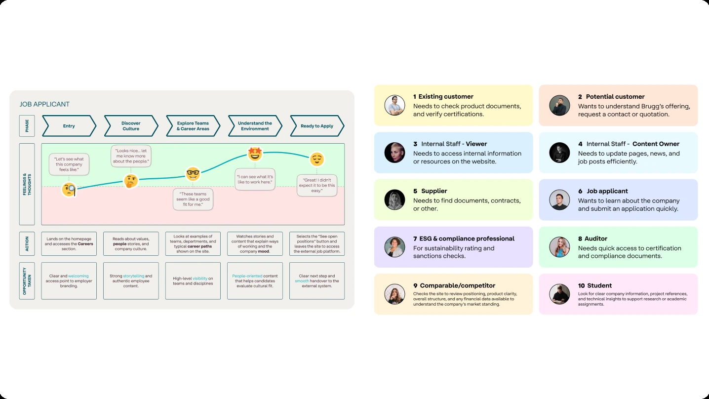
There was no budget or timeline for primary research with external users, customers, applicants, suppliers. To work around that, my team ran structured workshops across seven internal departments and built proto-personas from what came out of them. It gave us a wide, reliable picture of who used the site and why, but it was still a picture built from internal proxies, not from the people themselves.
What I discovered
Every department answered our questions differently depending on what they needed functionally from the site. What didn't vary was the cultural finding, the same sentiment surfaced across sales, HR, compliance, and engineering independently. That consistency turned a passing comment in a workshop into a constraint the whole redesign had to answer to.
Key decisions
The information architecture flipped the site's logic. Instead of leading with the product offer, it led with identity first, then what the company does. Fewer, richer destinations replaced a fragmented list of shallow pages, and a Knowledge Hub pulled together documents, certifications, and case studies that had been scattered with no home.
People don't apply for a job because they scanned a table of titles. They apply because the company feels worth joining.
One decision needed real conviction to hold. Careers got no shortcut to a list of open positions. People don't decide to apply for a job because they scanned a table of titles, they decide because the company feels worth joining. Recruiting stakeholders initially wanted the job list front and centre, and moving it back took a few rounds of making the case with the workshop findings, not just an opinion about UX best practice.
Trade-offs
Building proto-personas from internal workshops instead of from real customers, applicants, and suppliers was the right call given the constraint, but it's still a trade-off worth naming. Internal teams are good at describing what they need from a website. They're a weaker proxy for how an outside applicant or a first-time visitor actually behaves once they land on the page.
Solution
Four journey maps covered the highest-priority scenarios, from a job applicant evaluating culture before applying to a supplier trying to locate documents, tracing the emotional arc across the site's touchpoints rather than just the click path. Each journey turned into user stories for the development handoff, with the reasoning behind each requirement written in, not just the requirement itself.
The visual direction had one rule: feel like this company specifically, not like a template with their logo on it. Warm, editorial, still carrying the industrial weight of the product. Built on atomic design principles so it could scale past launch. The prototype covered desktop and mobile and was validated with stakeholders before handoff.
After the build was ready but before launch, I ran a systematic QA pass across the WordPress implementation, layout fidelity, responsive behaviour, interaction patterns, cross-browser consistency. That gap between a Figma file and what actually ships is where design intent quietly gets lost on most projects, and closing it before going live was part of the job, not an extra.
Impact
Every structural decision in the redesign was grounded in a specific, named user need instead of whoever had the loudest opinion in the room, giving the organisation a shared reference for future decisions. The prototype held up through stakeholder review and made it into development without the usual loss of intent. The WordPress build matched the Figma design, which is the step most projects quietly skip. And teams who had described the old site as something they were embarrassed to share ended the project showing the new one to colleagues.
My role
I led design on this project, working alongside a larger team that included a content team working in parallel, given the international scope and two-language site. I designed, ran, and synthesised insight from five stakeholder workshops across departments, and managed my team's work through the information architecture, journey mapping, and prototyping phases. I coordinated closely with the content team and with development, and ran the QA pass myself before launch.
What I'd do differently
I'd bring real users into the process from the start, as a discovery tool, not a final validation step. Talking directly to applicants, customers, and suppliers shapes which questions you ask in the first place, not just whether the answers you got were right.